
INDUSTRY:
Graphic Design
YEAR:
2025
EXPERIENCE:
Branding

Glitch.
about.
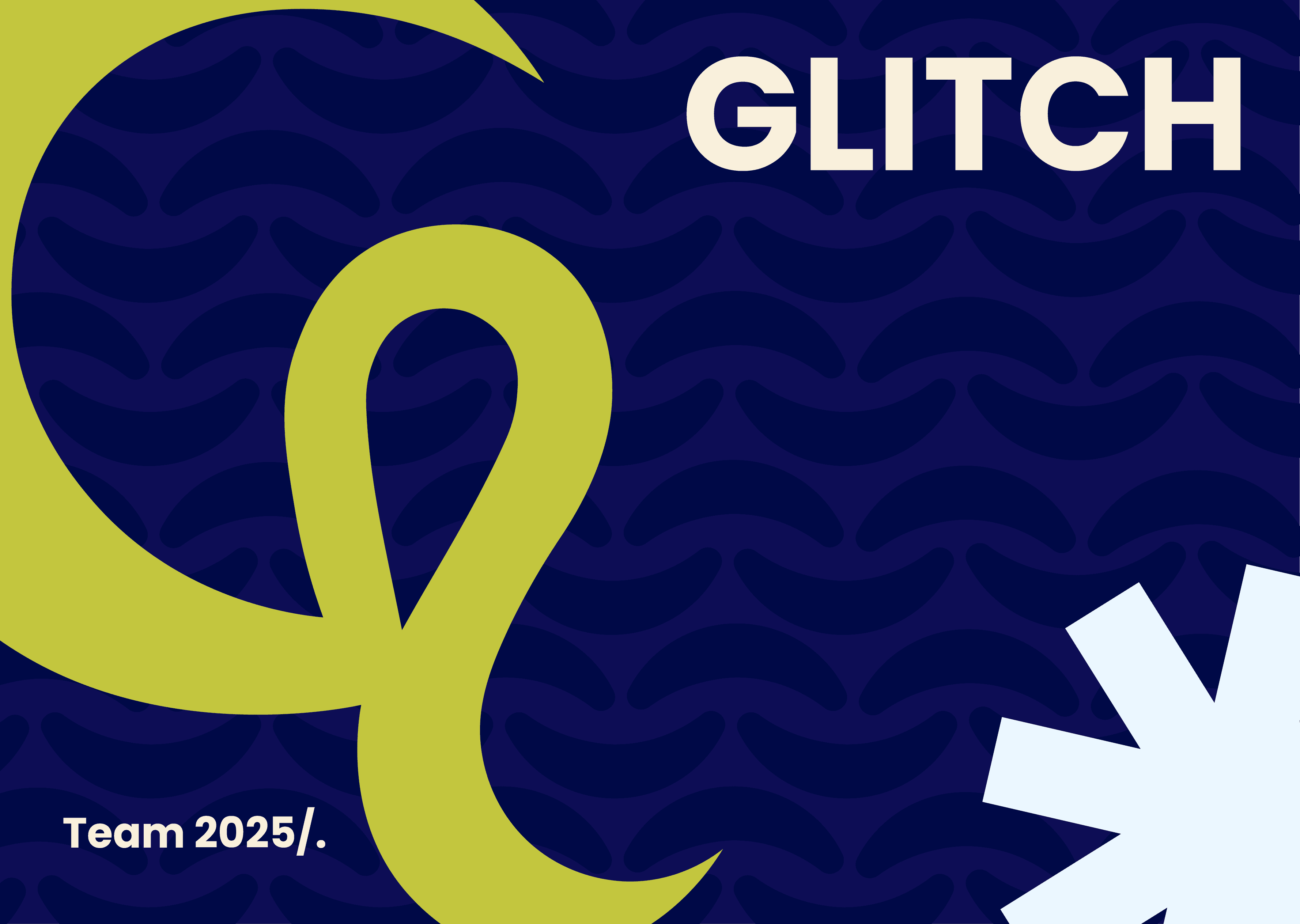
GLITCH is a collaborative brand identity and brand manual project created as the creative team behind the development of OKAI. The identity was designed to represent a modern digital product process: structured, adaptable, and visually intentional.
The visual system combines geometric typography, structured layouts, bold color contrast, and fluid graphic elements to reflect a team that works between strategy and experimentation. The goal was to create a brand that could feel creative and dynamic while still remaining clear, organized, and professional across digital touchpoints.
As part of the team, I contributed to the development of the brand’s visual direction and the design of the brand manual, including layout structure, color direction, graphic style, logo applications, and overall presentation. My role focused on helping create a cohesive and scalable identity system that could guide how GLITCH looks, feels, and communicates.
challenge.
The challenge was to create a visual identity that could represent the creative team behind OKAI while feeling modern, flexible, and distinctive in a digital-first environment.
Because the brand needed to communicate both structure and experimentation, the identity had to feel expressive without becoming chaotic. It also needed to remain clear and functional across different applications, including presentations, brand materials, digital products, and collaborative workflows.
This led us to build a system where bold visual elements, structured layouts, and flexible graphic components could work together consistently.
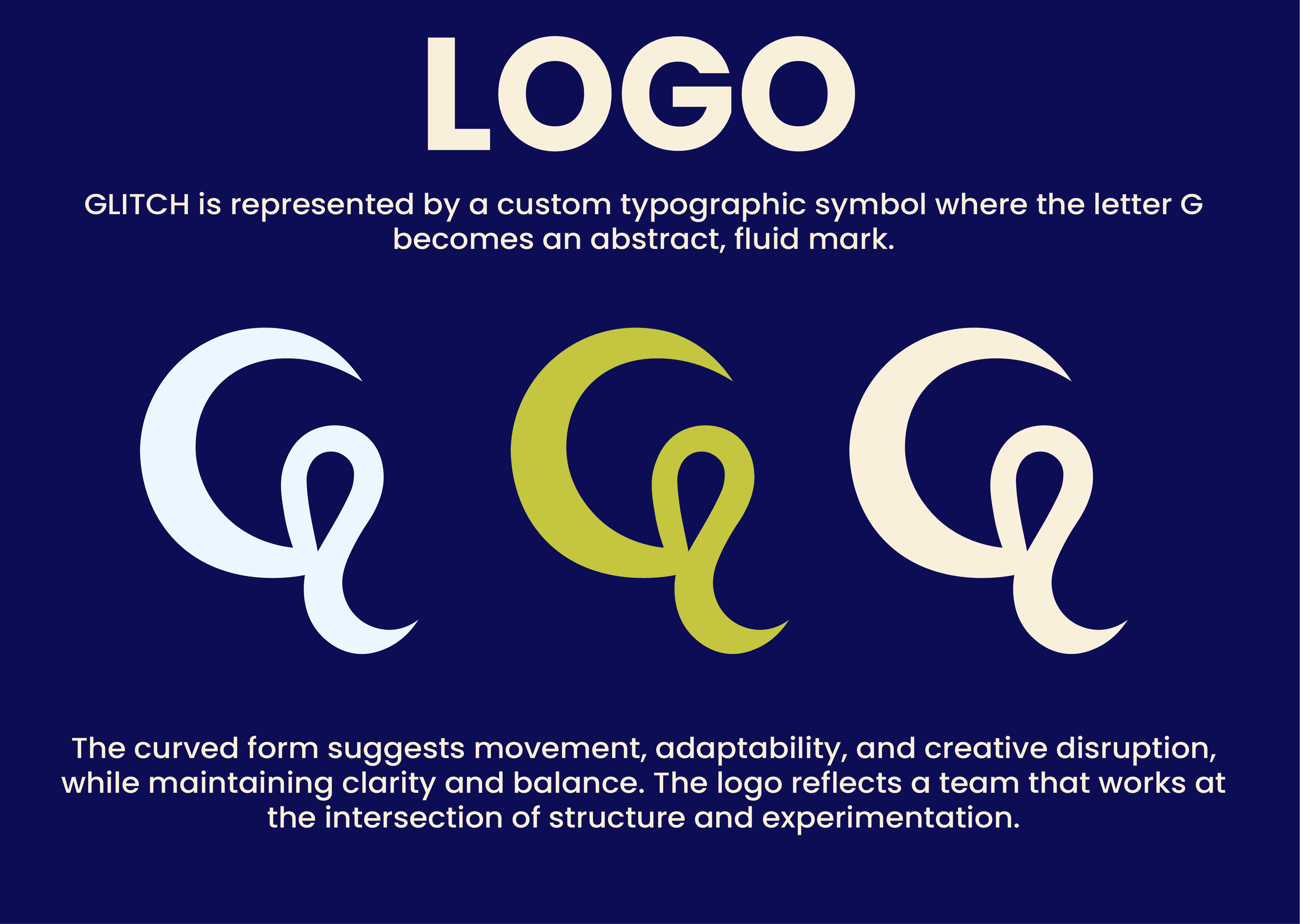
To reflect the name GLITCH without making the brand feel too distorted or difficult to use, the identity uses a balance of clean structure and fluid movement.
The custom “G” symbol became the main visual mark, combining a geometric base with a curved, abstract form. This helped communicate movement, adaptability, and creative disruption while keeping the logo recognizable.
The color palette uses strong contrast to create a bold digital presence, while grid-based layouts and consistent margins keep the system organized and easy to apply.
Typography, icons, and visual elements were designed to remain clear at different sizes, supporting scalability across slides, websites, and digital product applications.
result.
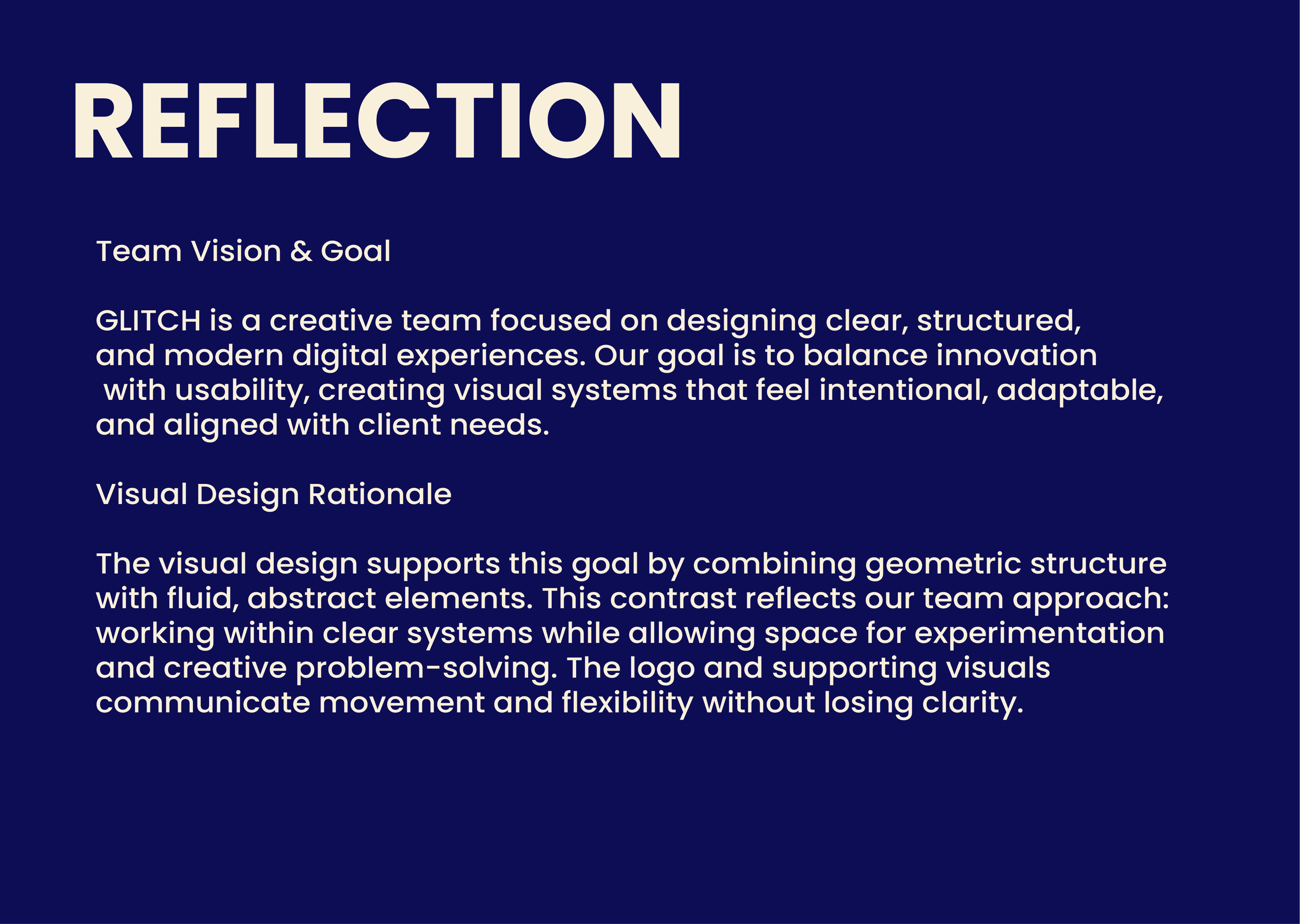
The final result is a flexible brand identity system and manual that gives GLITCH a clear, cohesive, and recognizable visual direction.
The system successfully balances bold typography, abstract fluid elements, and structured layout rules to communicate both creativity and clarity. It also provides practical guidelines for logo use, color, spacing, icon style, and visual consistency, making the identity easier to apply across future digital and presentation materials.

Key Insight.
GLITCH was not designed to look random or distorted, but to translate experimentation into a structured visual system that could grow with the OKAI project.

